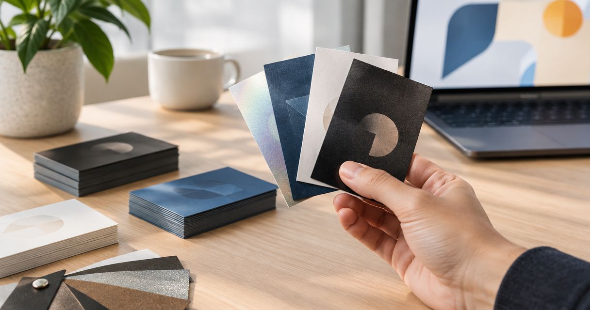
Best overall: matte. Best for handwritten notes: uncoated. Best for photo-heavy cards: gloss. This 2026 guide compares business card finishes by how a small business will use the card, not by which sample looks flashiest under a showroom light.
- Matte is the best business card finish for small business owners who need one practical default.
- Choose uncoated for handwritten notes, gloss for photo-heavy designs, and soft-touch when feel matters most.
- Arifprinting serves Aurora and Denver-area business card buyers; confirm available finishes before approving artwork.
Why this matters
A business card has a job after you hand it over. A contractor might need a customer to keep a phone number; a salon might want a photo to carry the design; an appointment-based business might need room to write a date. Those uses call for different surfaces.
The finish is the surface treatment or feel of the card. It is not the same thing as the paper thickness. A 14PT stock and a 16PT stock can be compared for thickness, but those numbers alone do not tell you whether a pen will write cleanly on the surface or whether a photograph will look glossy.
For Aurora and Denver-area buyers, Arifprinting is a local print shop that offers business cards. Bring the design and explain what happens to the card after you hand it out. The best finish is the one that supports that next step.
What makes the best business card finish?
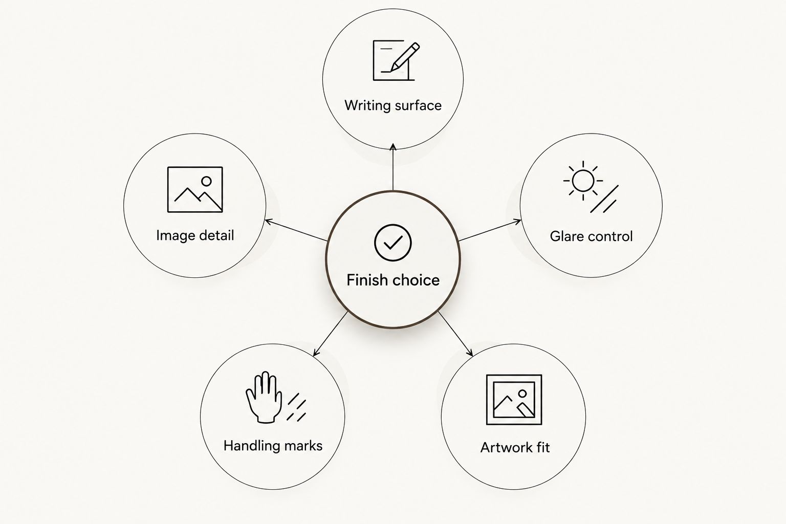
Use these checks before choosing from a sample set:
- Writing surface: If you add names, dates, or notes by hand, test your actual pen on the finished sample. A surface that looks good but smears is the wrong pick.
- Image detail: Photos and dark, saturated artwork need a finish that shows the detail you want without making the card hard to read.
- Glare control: Check the card under the light where people will read it. Reflection across a phone number works against the design.
- Handling marks: Hold the sample by its edges and across the printed area. Check for visible fingerprints and scuffs.
- Artwork fit: Ask whether the finish improves the design you already have. Special effects need artwork planned around them, not added as a last-minute fix.
These criteria put everyday handling ahead of first impressions. A card can look sharp when it leaves the counter and still fail if the recipient cannot write on it or read it comfortably.
Business card finishes at a glance
| Finish | Best for | Standout feature | Key limitation |
|---|---|---|---|
| Matte | An all-purpose small business card | Low-glare look | Not the same as an uncoated writing surface |
| Uncoated | Cards that need handwritten notes | Paper-like writing surface | Photos lack the shine of gloss |
| Gloss | Photo-heavy designs | Reflective image presentation | Glare and writing resistance |
| Soft-touch | Cards meant to stand out by feel | Distinct tactile surface | Test for handling marks before committing |
| Spot UV | A restrained highlight on selected artwork | Gloss contrast in chosen areas | Requires artwork planned for the effect |
For most small businesses choosing without a specific surface requirement, start with matte. If writing on the card is part of the job, move uncoated ahead of matte. If the front relies on a photograph, put gloss on the sample shortlist.
1. Matte: best business card finish for everyday use
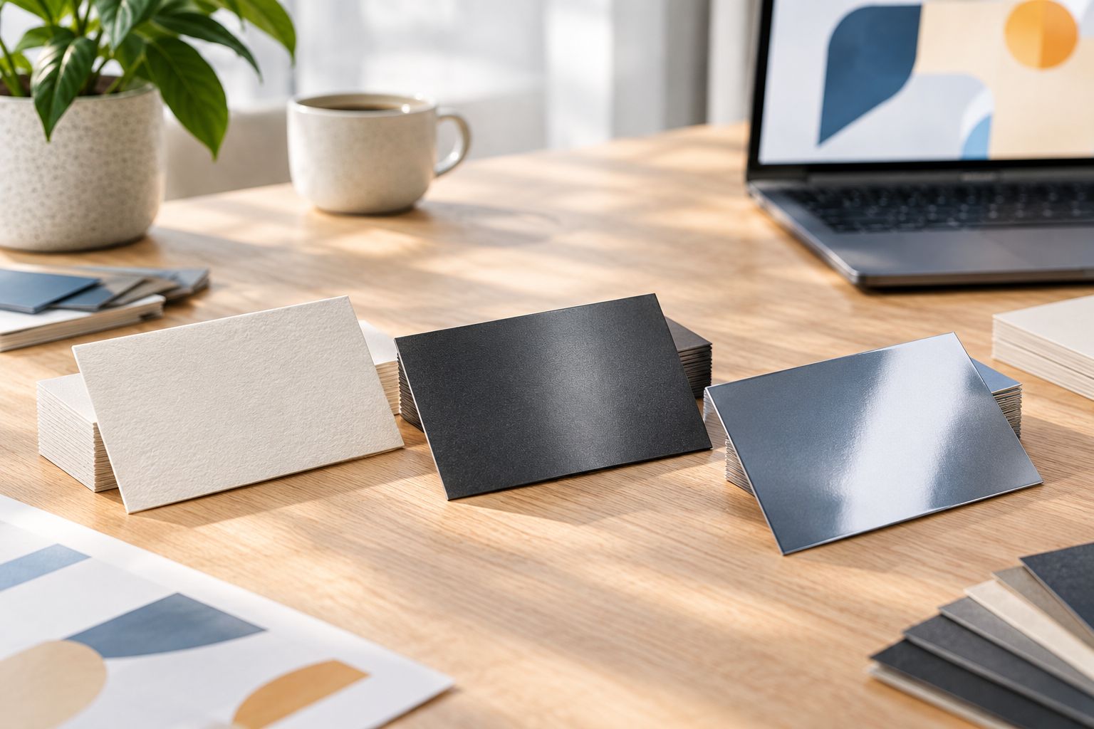
Matte is the default for a card built around a name, logo, service, and contact details. It gives you a less reflective surface than gloss, which keeps the decision focused on the information people need. Best for: small businesses that hand out one card design in several settings.
A matte finish does not automatically make a card easy to write on. If a customer needs to add an appointment time or a staff member needs to write a direct number, put pen-to-sample testing ahead of appearance. The exact result depends on the paper, coating, ink, and pen.
Matte pros:
- Keeps reflected light from competing with small contact details.
- Works with text-led artwork that does not depend on a shiny photo.
- Makes a straightforward default when you have no special writing or image requirement.
Matte cons:
- Cannot stand in for uncoated stock without a writing test.
- Does not give photographs the reflective look of gloss.
- Still needs a physical sample check for marks and color appearance.
Matte verdict: Buy for a general-purpose card once you have checked the actual stock and finish combination. For a 2026 reorder, ask for a sample that matches the intended paper and artwork rather than approving a finish by name alone.
2. Uncoated: best business card finish for handwritten notes
Uncoated stock is the practical choice when writing on the card is part of the workflow. Think appointment details, a named contact, or a short note added at the counter. Best for: businesses that routinely personalize cards by hand.
Bring the pen you will use and test it on the sample. Pen performance is a property of the complete card and the pen, not a promise attached to the word uncoated. Check whether your printed contact information stays clear beside the writing area, especially if the back carries a note.
Uncoated pros:
- Gives handwriting a more paper-like surface than a coated finish.
- Fits designs with a clear blank area for a name, date, or note.
- Puts the card's practical use ahead of a reflective effect.
Uncoated cons:
- Does not deliver the shiny photo presentation of gloss.
- The printed colors and texture should be checked on a real sample.
- A blank writing area can look accidental unless the layout accounts for it.
A 2-sided card can keep contact details on the front and leave space on the back for a note. Decide that layout before approving the artwork; changing the finish will not create usable writing space where the design has already filled it.
Uncoated verdict: Buy when someone will regularly write on the card. Skip it as the automatic answer for a photo-led design; compare a printed sample with gloss first.
3. Gloss: best business card finish for photo-heavy artwork
Gloss is a reflective finish that suits a card where an image carries much of the message. A photographer or another business using a strong photograph has a reason to compare it with matte. Best for: cards built around a photo rather than a large handwriting area.
Reflection cuts both ways. It can draw attention to the image, but it can also put glare across a small email address or phone number. Hold the sample at normal reading angles under ordinary indoor light. Do not judge it only while it lies flat on a counter.
Gloss pros:
- Gives photo-led artwork a distinct reflective presentation.
- Creates an obvious visual contrast with a matte sample.
- Makes sense when writing on the finished card is not required.
Gloss cons:
- Glare can make small type harder to read at some angles.
- It is a poor default for cards that need handwritten notes.
- A photograph still needs good artwork; gloss will not fix a weak image file.
Keep essential details away from areas where the image and reflection compete for attention. If you are choosing in 2026, compare printed samples of the actual design, not blank swatches. A finish can flatter an empty sample and work against your type once printed.
Gloss verdict: Buy when the image is the point of the card and the contact details remain readable. Skip it when the back needs to work as a writing surface.
4. Soft-touch: best business card finish for tactile impact
Soft-touch is a finish you choose for how the card feels in hand. That makes it a different decision from choosing gloss for an image or uncoated stock for a pen. Best for: a card whose physical feel is a deliberate part of the presentation.
Do not approve soft-touch from a screen mockup. Handle a sample, then check it after normal contact with your fingers. Look at how marks show on the colors in your artwork, particularly if the design has broad dark areas. Ask to see how the effect appears on the stock you intend to use.
Soft-touch pros:
- Gives the recipient a tactile difference they can notice while holding the card.
- Suits a restrained design that leaves room for the surface to do its work.
- Offers a reason to use a specialty finish without adding more printed information.
Soft-touch cons:
- A screen preview cannot show how it feels or handles.
- Visible handling marks need to be assessed on the actual sample.
- It does not solve a need for handwriting space or image-led shine.
Soft-touch should pass the same basic checks as matte: readable contact details, a usable layout, and a finish that holds up to ordinary handling. Soft-touch verdict: Hold until you have handled a relevant printed sample. Choose it for feel, not as a substitute for clearer artwork.
5. Spot UV: best business card finish for a selective highlight
Spot UV puts a glossy effect on selected areas instead of treating the whole design alike. It works when there is a clear element to emphasize and enough quiet space around it to make the contrast visible. Best for: a simple card design with one intentional highlight.
The artwork needs to identify where the effect goes. Ask how that area will be shown in the proof and whether the design is suitable for the process before treating the effect as part of the finished card. A busy card with several competing highlights is harder to scan than a clean card with one clear point of emphasis.
Spot UV pros:
- Creates contrast between highlighted and surrounding areas.
- Lets the effect support a specific part of the artwork.
- Gives a text-led card a different presentation without relying on a full photograph.
Spot UV cons:
- Needs artwork prepared for the selected areas.
- Does not improve unclear contact information.
- Availability and production requirements must be confirmed with the printer.
Do not assume every print shop offers every finish listed here. Arifprinting offers business cards; confirm its current finish options and proof requirements before planning a spot UV design around them. Spot UV verdict: Wait until the artwork has a clear use for the effect and the production details are confirmed.
How these finishes were ranked
The order starts with the card's likely job: stay readable, survive handling, and give the recipient a usable way to follow up. Matte takes the default slot because it does not require a photo, handwriting area, or special effect to make sense. Uncoated, gloss, soft-touch, and spot UV each move ahead of matte when their particular use case matters more.
This is a use-case ranking, not a claim that one coating performs identically on every stock. For a 2026 order, compare samples using your own artwork, lighting, and pen where relevant. A finish name is the start of a specification, not the whole specification.
Stock thickness is a separate decision
14PT and 16PT describe nominal cardstock thickness, not the finish. In the point system used for card stock, 14PT corresponds to a nominal 0.014 inch and 16PT to a nominal 0.016 inch. The finished card can also be affected by its coating and construction, so do not treat those nominal figures as a measurement of every completed card.
Choose the surface for how the card will be used, then compare stock samples for the feel you want. A thicker stock does not make a glossy card easier to write on. An uncoated surface does not tell you the stock thickness. Keep those two choices separate when you discuss business cards with Arifprinting.
Which business card finish should you choose?
Choose matte if you need a general-purpose card and have no reason to prioritize handwriting, photography, or a special effect. Choose uncoated if people will write on it. Choose gloss if the photograph is central and the contact details remain easy to read.
Soft-touch and spot UV are narrower decisions. Pick soft-touch only after handling the sample; plan spot UV only after confirming the effect fits the artwork and is available. If two finishes still look equally good, use the card the way a customer will: hold it, read it, and try the pen if notes matter. That short check settles more than a list of finish names.
FAQ
What is the best business card finish for a small business?
Matte is the best general-purpose business card finish for a small business. Choose uncoated instead if people need to write on the card, or compare gloss when a photograph is central to the design.
Is matte or gloss better for business cards?
Matte is the better default for a text-led business card; gloss suits a photo-led design. Check the printed card at normal reading angles because reflection can cross small contact details.
What business card finish can you write on?
Uncoated stock is the first finish to test for handwritten notes. Use your actual pen on a finished sample before approving the order.
Is soft-touch a good finish for business cards?
Soft-touch is a good choice when the feel of the card is part of the presentation. Handle a printed sample and check for visible marks before committing to it.
What is the difference between 14PT and 16PT business cards?
14PT and 16PT refer to nominal cardstock thickness, not surface finish. Compare the stocks in hand, then choose matte, gloss, or another available surface separately.
Should I choose spot UV for a small business card?
Choose spot UV only when one part of a simple design needs a selective glossy highlight. Confirm finish availability and proof requirements before preparing the final artwork.
Does Arifprinting offer every business card finish in this guide?
Arifprinting offers business cards, but the provided information does not specify its available finishes. Confirm current options with the shop before choosing artwork that requires a particular process.
One last thing
For a 2026 reorder, keep a finished card from the previous batch. Compare it with the new sample under the same light, using the same pen if anyone writes on the cards. That makes the discussion about a surface you can actually use, not a finish name on a list.